
Qualia - Eyes and Perception
2017.09 | Exhibition - Graphic Design
PART I _ MARY'S ROOM
메리의 방은 감각질에 대한 사고실험이다. 시지각과 색인식에 대한 모든 물리적, 생물학적 지식을 가지고 있지만 흑백의 방 안에서만 살아 색을 경험하지 못했던 과학자 메리. 그녀는 어느 날 방을 떠나 다양한 색을가진 세상을 보게 된다. 메리는 색에 대한 모든 지식을 가지고 있었음에도 직접 경험하기 전에는 색을 알지 못했던 것이다. 본 전시에서 작품들은 그 각각의 경험이 의미와 가치를 지니고 있다는 것을 보여준다.
The Mary's room thought experiment proposed by Frank Jackson describes qualia. Mary, who lives in the black and white room thus has never seen color, is an expert in color vision and knows everything ever discovered about its physics and biology. One day, she goes out the room and experience color. Even if she knew all the information about color, she was not able to understand until she experienced it. Works show that the experience from different perspectives has its original meaning and value.
Aurora 01

Aurora 02

오로라는 우리의 감각 중 순수하게 시각을 통해서만 관찰할 수 있는 빛의 환영이다. <Aurora>시리즈는 이러한 오로라를 프로그래밍을 통해 색선으로 표현했다. 이 작품을 구성하는 프로그래밍 정보와 제한된 색을 통해 이 작품을 본다면 우리는 이 작품을 온전히 안다고 할 수 있을까? <Aurora01>은 <Aurora02>를 색약의 한 종류인 프로토노피아의 시각으로 시뮬레이션한 것이다. 이 작품은 언어적으로 표현할 수 없는 경험적 정보와 감각질에 대해 이야기하려 한다.
Auroras are natural light shows that can only be observed through our sense of sight. The <Aurora> series express this phenomenon by colored lines created by computer programming. If we know the code based information that creates <Aurora 02> but observe the artwork with limited color range as in <Aurora01>, can we say we truly "understand" this artwork? <Aurora 01> is a limited color version of <Aurora 02> with a protanopia color vision deficiency filter applied. This work attempts to talk about our subjective experiences that can not be expressed verbally.
Perfect Shape 01
Perfect Shape 02

세상에 완벽한 것이 무엇이 있을까? <Perfect Shape>에서 도형들은 다양한 모습을 통해 저마다의 개성을 뽐낸다. 이런 다양한 모습들 중 하나만을 골라 완벽하다고 주장할 수 있을까? 완벽하다는 기준은 매우 객관적인 것 같지만 사실 굉장히 주관적이다. 우리가 어떻게 보는지는 맛보거나 냄새맡는것과 같이 주관적인 인지 경험이다. <Perfect Shape 02>에서는 도형 안의 선들이 보이지 않는다. 색약의 시각에서 일반적인 시각보다 색을 알아보기가 더 어려운 대신 적녹 위장을 간파하기 더 쉽기에 앞에서는 선들이 보였지만 색이 더해진 지금은 보이지 않게 된 것이다. 이 작품에서는 어떻게 감각하는지와 그 결과가 그 감각의 가치와 의미를 결정하는 것은 아니라는 것을 이야기하고자 한다.
What is perfect in the world? In <Perfect Shape>, shapes show their individuality through various forms. Can you pick one of these various aspects and claim it to be perfect? The standard of perfection seems to be very objective but in fact, it is very subjective. How we see is a subjective cognitive experience, such as taste or smell. Even if darker lines are visible in <Perfect Shape 01> which is the protanopia filter applied version of <Perfect Shape 02>, the darker lines in the shapes are less or not visible in <Perfect Shape 02>. Despite the difficulty in identifying colors, it is much easier for a color blind person to see through red-green color camouflaged pattern. So in full-color version, it is hard to catch the camouflaged lines for a person with normal vision. This work aims to point out the result of how we sense does not determine the value and meaning of those.
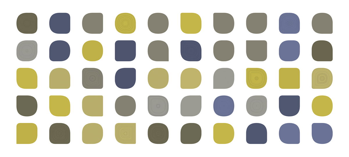
Diversity
보통의 수준에서 색을 인지하는 사람들과 색각이상을 가진 사람들, 색맹에 이르기까지 모든 사람들은 같은 대상을 통해 자신만의 색을 본다. <Diversity>에서는 하나의 개념을 통해 소통되지만 사실 개인의 차원에서는 다양하게 감각되는 색의 가능성들에 대해 이야기한다. 특히 색약이 단순히 빨강과 녹색을 전혀 구분하지 못한다고 생각하는 경향을 비판하며 색각이상의 정도와 종류에 따라 다양하게 나타날 수 있다는 것을 보여주려 한다.
People who perceive color from normal vision to three different types of mild and strong color vision deficiency see their unique colors depending on their condition. The work <Diversity>, aims to point out that the difference of how we perceive color can be different from each other. In particular, it criticizes the tendency to think that a color vision deficient cannot distinguish between red and green, and shows that it can vary widely depending on the degree of their condition.
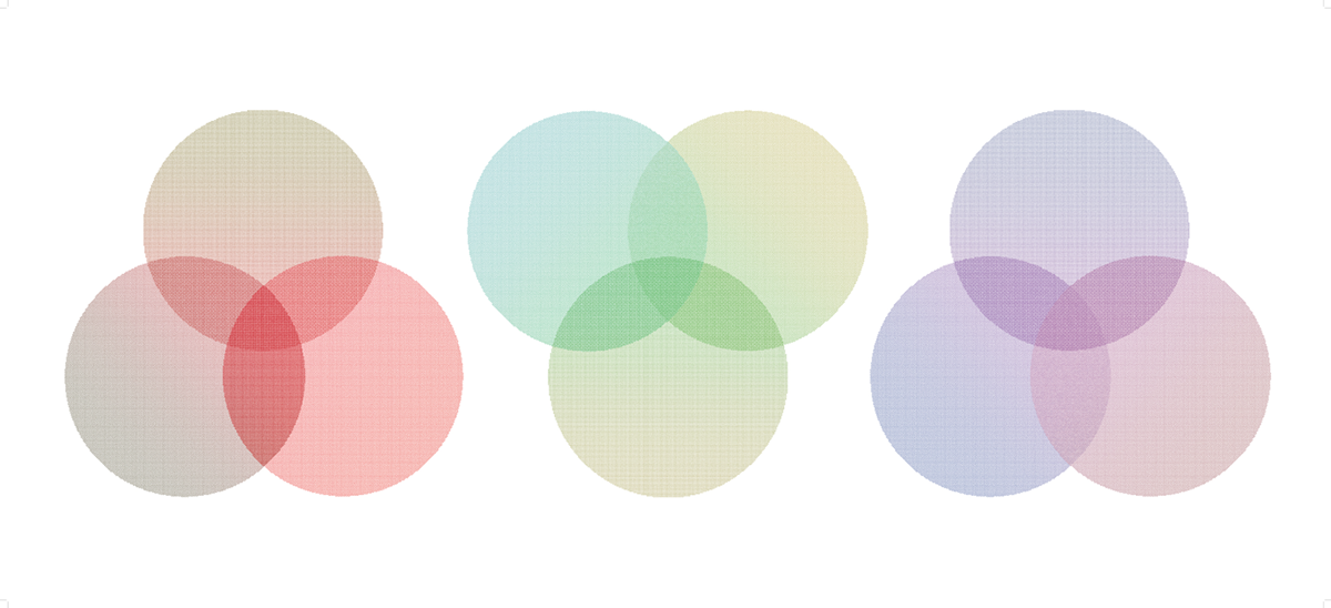
PART II _ INVERTED SPECTRUM
로크의 역전 스펙트럼은 감각질에 대한 사고실험이다. 색은 개인적인 경험이고 공유할 수 없기 때문에 우리는 다른 사람들이 실제로 어떻게 보는지 경험할 수 없다. 만약 색의 스펙트럼이 역전되어 내가 녹색을 볼때 다른 사람이 빨간색을 보더라도 우리는 알수 없는 것이다. 피안타니다의 1974년 논문은 확률적으로 10,000명의 남성 가운데 14명이 역전 스펙트럼이 가능하다고 주장한다. 과학적으로 증명되지는 않았지만 이러한 사고실험은 철학적으로 중요한 의미를 가진다. 본 작품들은 색을 통해 우리 중 있을 수 있는 역전 스펙트럼의 소유자, 더 나아가서는 색뿐만 아니라 다양한 감각에서의 각 개인의 공유불가능한 경험들에 대해 이야기하고자 한다.
John Lock’s inverted spectrum is one of the most famous thought experiments on qualia. Even the colors are individual experiences, which cannot be shared, and we have no chance to experience actually what other people see. If one’s color spectrum inverted, so we see other colors in one object, we can’t tell this. In Piantanida’s paper(1974) it is estimated that 14 out of 10,000 men would have spectrum inversion. Though not scientifically proven, these thinking experiments have philosophical significance. By the use of colors, three poster series not only focus the possibility of being the person with inverted spectrum but also intend to let audiences think about our subjective experiences that are impossible to share.


바나나는 그 맛과 질감을 색을 통해 구분할 수 있다는 점에서 흥미롭지만 적녹색맹에게 바나나의 연한 녹색과 노란색을 구분하는 것은 굉장히 힘들다. 이를 통해 우리는 색이 우리의 생활에서 얼마나 중요한지 알 수 있다. 이러한 바나나를 소재로 삼아 한 판매대의 바나나만 색을 바꾸어 역전 스펙트럼으로 본 시각의 가능성과, 그럼에도 우리는 영원히 그러한 시각에 대해 알 수 없을 것이라는 것을 상기한다.
Bananas are interesting as we can distinguish their taste and texture through color, but it is very difficult for the people with red-green color vision deficiency to distinguish between light green and yellow. Through this, we can see how important color is in our lives. By changing the color of those bananas to a different color, this work aims to talk about the possibility of the inverted spectrum and the fact that we will never truly understand such a color vision.

우리는 음료를 살 때 병의 색을 보고 그 음료가 어떤 것일지 직관적으로 인지한다. 음료 포장 역시 그 맛에 의해 결정된다. 하지만 사실 그들 사이에 직접적인 연관은 없다. 경험에 의해 이러한 연관짓기가 발생하며, 우리가 이전에 경험하지 못했던 방식으로 색이 나타나게 되면 우리는 혼란스러워진다. 우리 옆에 있는 사람이 역전 스펙트럼의 시각에서 세상을 보고 있다는 아이디어는 이러한 비 연관성에 대해 다시 생각해보게 한다.
When we buy a drink, we see the color of the bottle and intuitively recognize what the beverage is. Beverage packaging is also determined by its taste. But in fact, there is no direct connection between them. Our experiences responsible for these associations, and we become confused if colors appear in a way we have never experienced before. The idea that the person next to us might look at the world from the perspective of the inverted spectrum makes us reconsider this uncertainty.

크레용은 다양한 색의 선택지를 제공하고, 어린 시절에 학교에서 마주하는 물건이라는 점에서 독특하다. 학교에서 우리는 우리가 어떻게 색을 식별하는지에 따라 색을 이름짓고 사용하는 법을 배우게 되지만, 우리 각각이 인지하는 색은 적든 많든 차이가 있을 것이다.
Crayons are unique in that they offer a variety of color choices and are objects that we experience at school throughout childhood. Even if we learn how to name and use those colors at the school, our qualia of those colors may vary.
Invitation Card

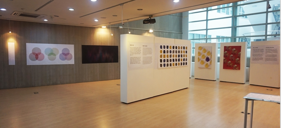
Exhibition Space
작품들은 서울대학교 디자인연구동 삼원 S&D홀에서 2017년 9월 1일부터 9일까지 전시되었다.
Works have been exhibited at Seoul Nat'l University, Design Research Center, Samwon S&D Hall between 01.09.2017 and 09.09.2017.
For those who are interested in Color Perception, Qualia and Color Vision Deficiency, here are some articles that I have found insightful:
Mary's Room
Qualia - Stanford Encyclopedia of Philosophy
Inverted Qualia - Stanford Encyclopedia of Philosophy
Color Perception by Michael Kalloniatis and Charles Luu
Tetrachromatic Vision
Advantage of dichromats over trichromats in discrimination of color-camouflaged stimuli in humans
Colour blindness not all it seems
Do you see what I see?
Thank you for watching!


